Dr. William Phillips was a New Zealand-born economist who died in 1975. However, his name lives on with the famous Phllips Curve, which looks like this:

Still, it remains one of the principal "tea-leaves" in predicting the Fed's next action. After all, the very low level of unemployment currently means rampant inflation is imminent, and interest rates must be increased now, right? The problem is that the Fed's tools (CPI and PCE) are backward looking.
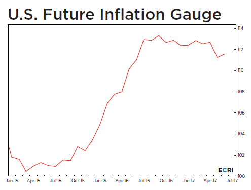
Alan Greenspan's favorite inflation measure was the FIG -- Future Inflation Gauge. It is forward-looking. For the last year, FIG has been moderating, as shown in this graph:


Basically, it says there is an inverse relationship between unemployment and inflation. If you want to decrease unemployment, all you have to do is increase inflation. If you want to decrease inflation, all you have to do is increase unemployment. However, some call this "the zombie graph," because it will not die. Belief in the graph is strong and enduring, especially at the Fed. This relationship between unemployment and inflation appears to be realistic only in the short-run but not the long-run. There have been numerous periods of low inflation and low unemployment.
Still, it remains one of the principal "tea-leaves" in predicting the Fed's next action. After all, the very low level of unemployment currently means rampant inflation is imminent, and interest rates must be increased now, right? The problem is that the Fed's tools (CPI and PCE) are backward looking.
Alan Greenspan's favorite inflation measure was the FIG -- Future Inflation Gauge. It is forward-looking. For the last year, FIG has been moderating, as shown in this graph:

So, should the Fed look at the current level of unemployment and raise rates or look at the FIG and hold rates steady? Doing nothing is the right answer!
Of course, there are other reasons to raise interest rates. For example, it is important to have some "dry powder" or room to decrease rates during the next, always-inevitable recession. I expect one more increase this year but no more.
Of course, there are other reasons to raise interest rates. For example, it is important to have some "dry powder" or room to decrease rates during the next, always-inevitable recession. I expect one more increase this year but no more.